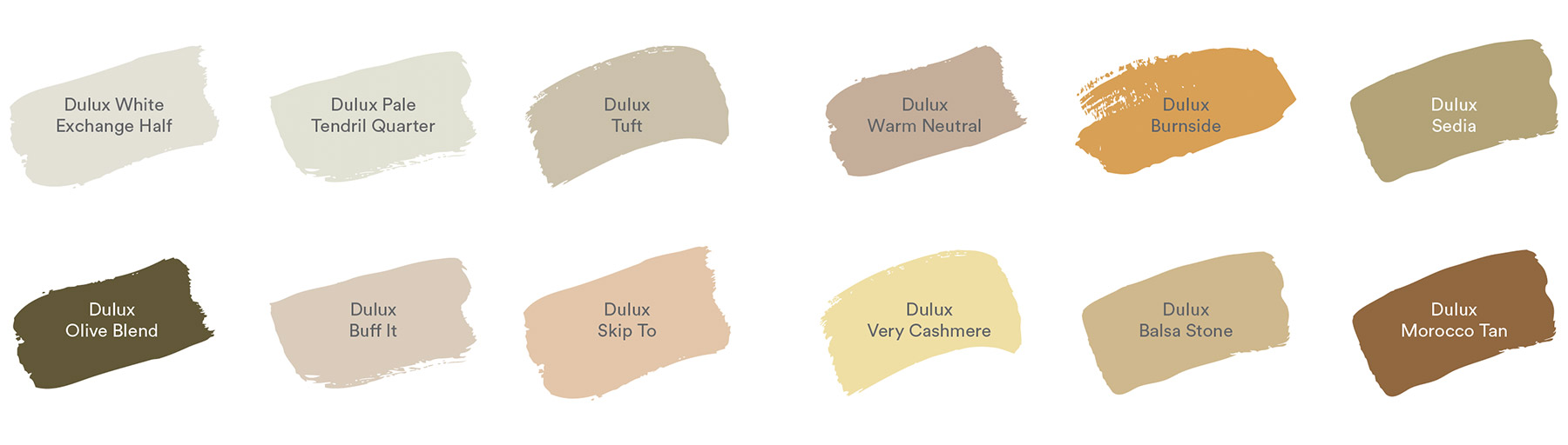
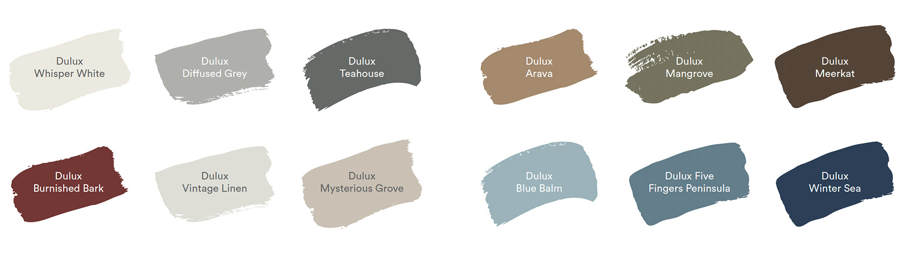
The Dulux Colour Forecast 2021
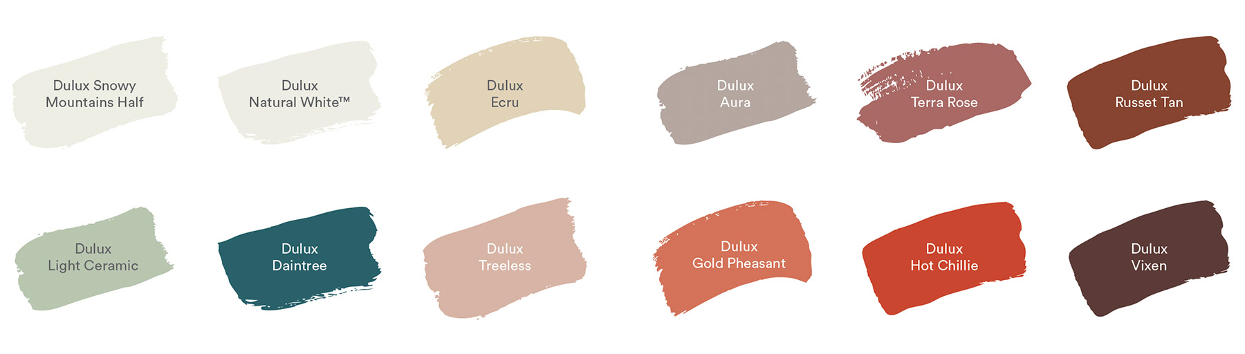
The Dulux Colour Forecast 2021 comprises of three soothing palettes, inspired by nature along with moments of stronger colour to lighten the mood and brighten our outlook. “Surrounding colour can be a remedy for the soul in challenging times,” says Andrea Lucena-Orr, Dulux Colour and Communications Manager. “This year’s soft, earthy neutrals, muted greens and gentle mauve-greys provide a reassuring connection with nature, whilst richer and brighter hues, such as coral and stormy blue awaken our senses and allow for moments of optimism.”
As we move through 2020 and establish what has become our ‘new normal’ more than ever our homes have become the central hub of our lives. We’ve experienced a distinct break in human connection and socialisation and become increasingly reliant on technology to make connections with others. Conversely we yearn for a disconnect from the constant stream of information so we can reset, reflect and recharge.
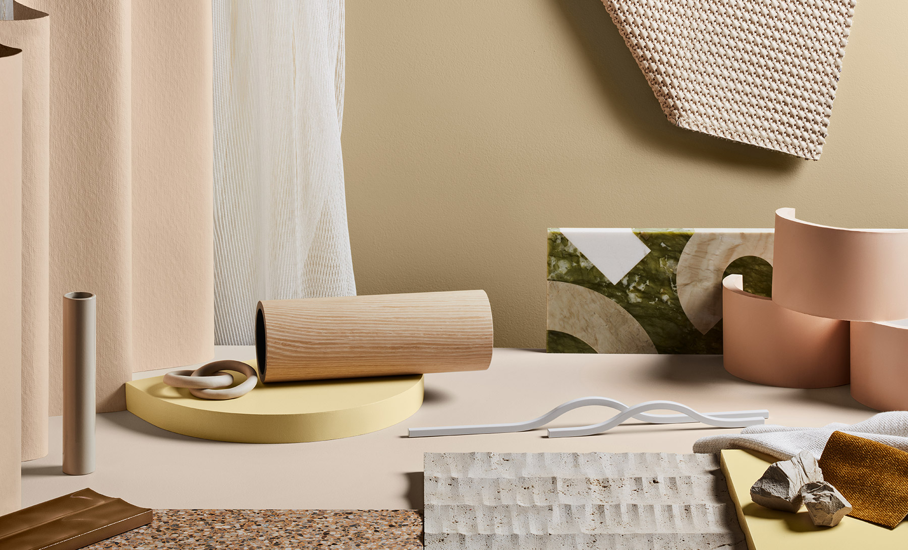
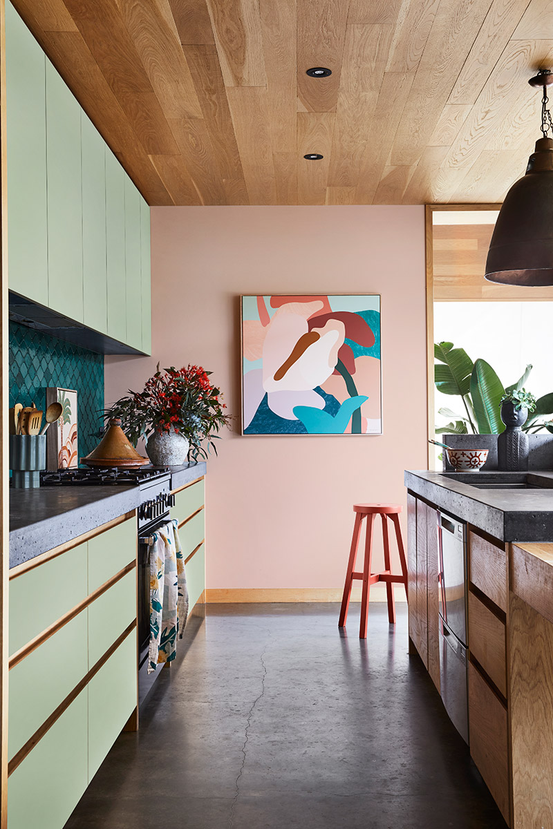
Nourish
Dulux describes the Nourish concept and palette: Whilst most of us are required to experience the world from within the four walls of our home, we are facing digital saturation at its most extreme. Craving time and space away from our screens, there is a renewed appreciation for nature and rituals of self-care to help soothe the mind and create an aura of calm and sense of wellbeing.
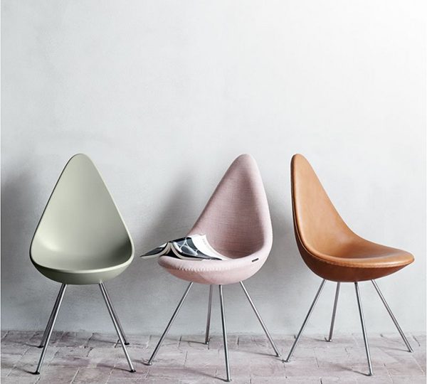
The Nourish palette plays into this longing for natural beauty and earthly connection. Biophilic hues of mossy and sage greens, turmeric and citrus connect us to nature, inspiring us to fill our homes and workspaces with plants and blooms. The tactility of materials and raw textures provide a level of physical comfort to the touch, whilst the round-form surfaces and soft-shaped furniture offer visual relief to encourage revitalisation
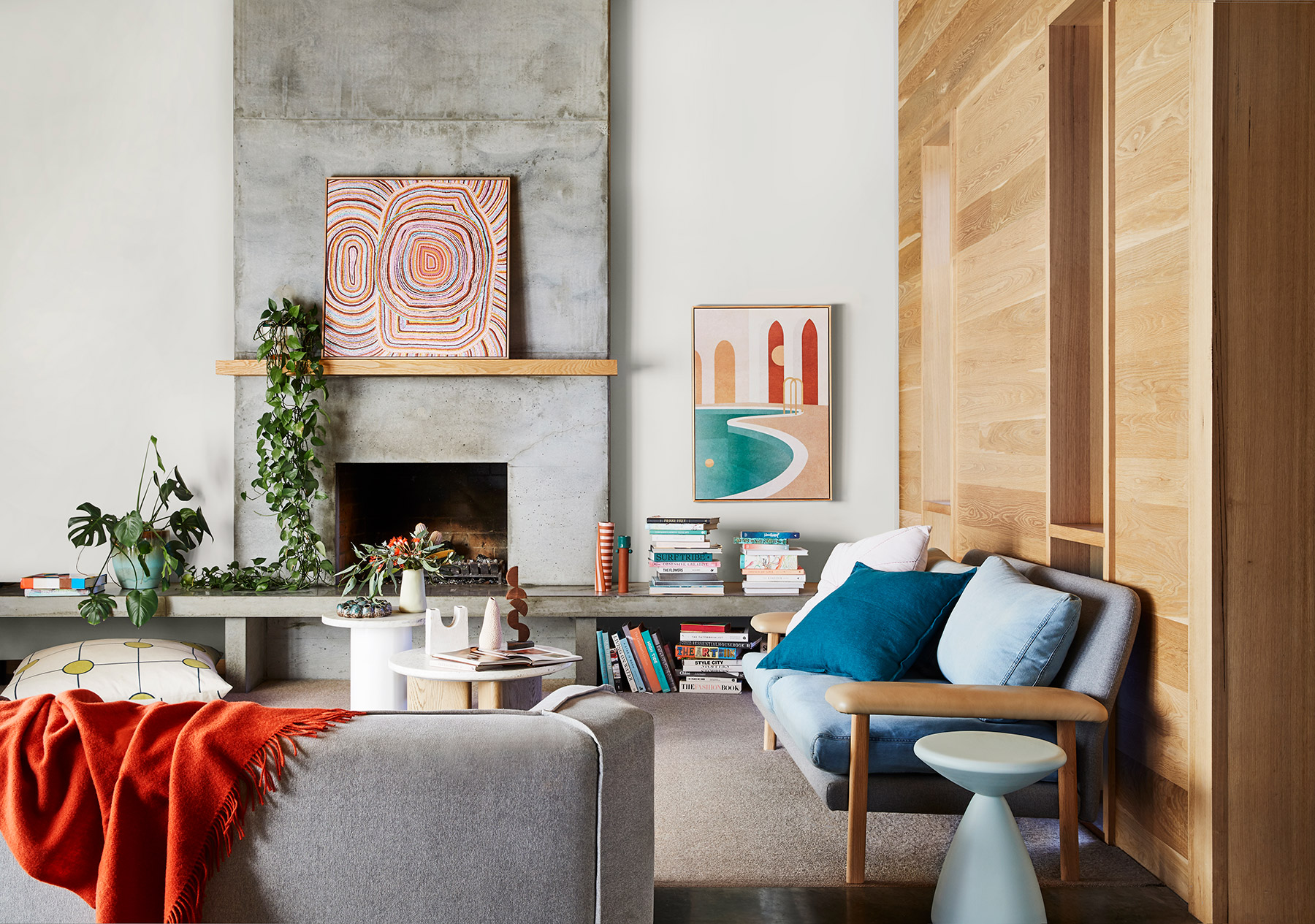
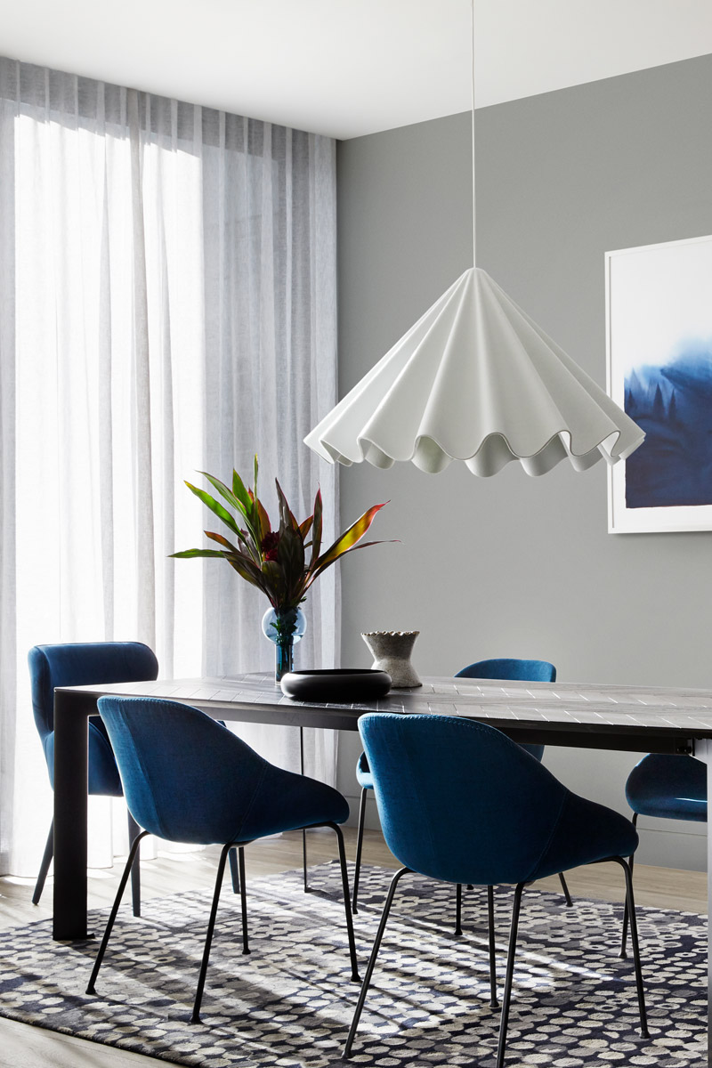
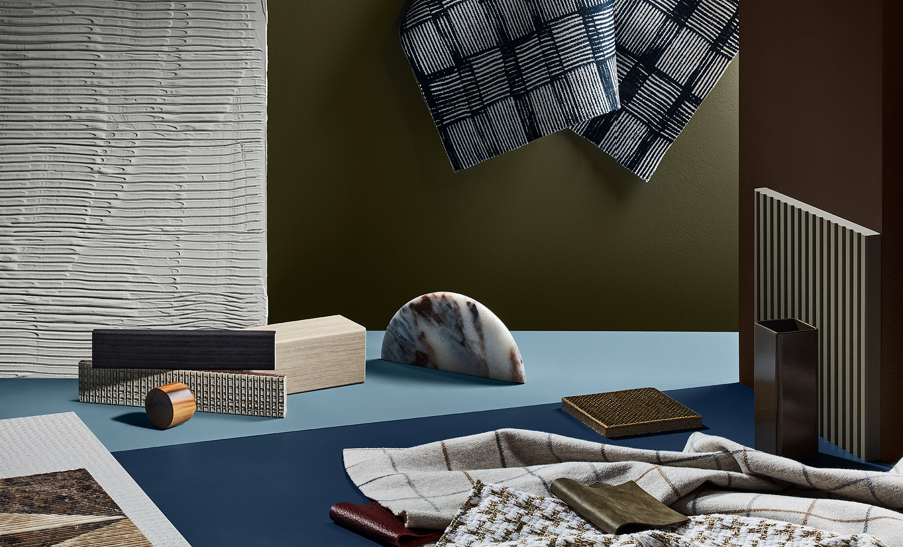
Retreat
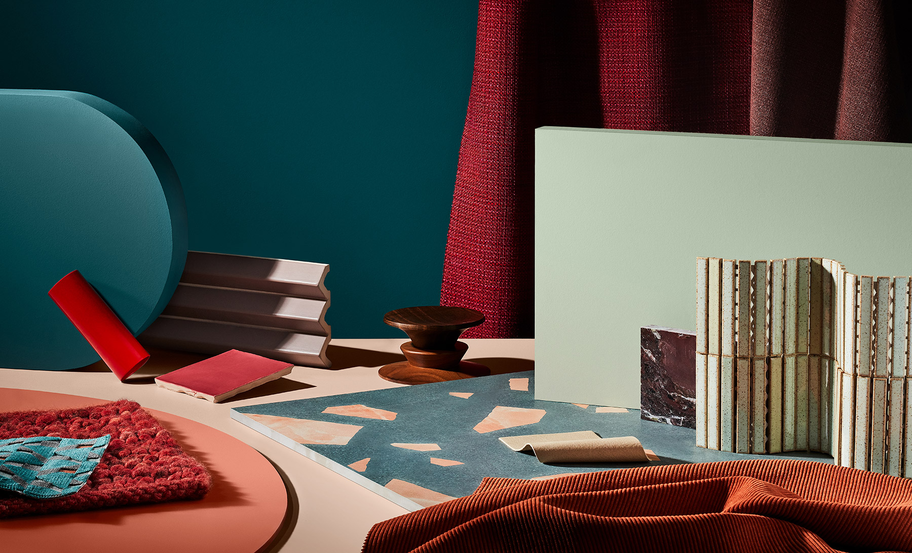
Dulux describes the Retreat concept and palette: Our idea of what home means has evolved. What was once a place for solace and recuperation is now our vehicle for daily life – from sleeping, eating, working to exercising. As our work-life boundaries continue to blur, we delve deeper in search of balance, restyling our spaces to accommodate our flexible lifestyle. We seek out the security of well-loved DIY traditions like cooking, baking and crafting to help us feel grounded and present.
The retreat palette draws on nostalgia to create that sense of familiarity and refuge we crave – incorporating up-cycled materials in raw and natural timbers, and vintage accents such as ceramics and weavings alongside modern utilitarian-shaped décor pieces to create a well-worn, yet timeless look. Stormy blues channel tranquillity, signifying better times to come, whilst essential whites and burgundy feed our sense of the familiar and tradition.
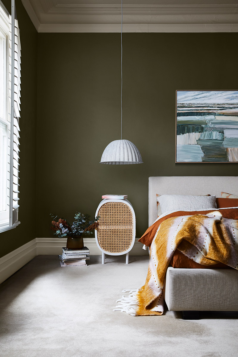
Reset
Dulux describes the Reset concept and palette: In the wake of our ‘new normal,’ a level of adaptability, positivity and resilience is on the forefront of our minds as we shift to a slow-paced lifestyle, far removed from the adventure and excitement we once thrived on. Reflecting on what is most important to us, we draw closer to our families and local community.
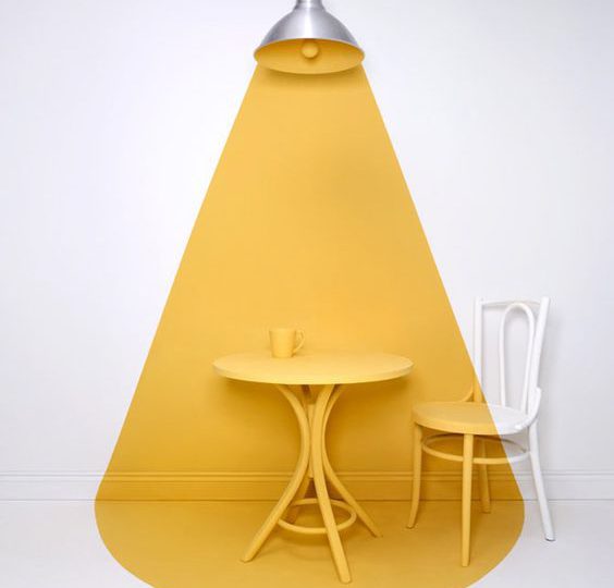
The Reset palette reflects our renewed energy and desire to brighten our outlook as we adapt to home life. Subtly inspired by the 70s, uplifting hues of blue-green and energetic reds offset contrasting whites and neutrals. Furniture styles and materials are mixed but unified with colour combinations for a more eclectic approach to design; whilst quilted fabrics paired with objects and mementos from past travels elevate the level of comfort and cosiness in the space. With a strong focus on family living, furniture is durable and generous in shape and form.
Find out more about the Dulux Colour Forecast 2021 on their website here.
Colour is a powerful tool in design and an integral part of our career courses. Our students explore colour theory and residential schemes in our Certificate IV in Interior Decoration course, they then extend this knowledge into exterior and commercial colour in our Diploma of Interior Design and Advanced Diploma of Interior Design.
If you’re interested in learning more about how colour is used in interiors we run a Colour for Interiors online short course through our partner Interior Design Online. Click here to find all the course information.
You may also be interested to read:
Australian Interior Design Awards 2020 | The Best of Residential Decoration