Australian Interior Design Awards 2018 | Retail Design Shortlist
The Australian Interior Design Awards 2018 shortlist has been announced. Backed by the Design Institute of Australia, these industry-based awards recognise and celebrate interior design excellence.
The awards categories comprise of retail design, hospitality design, workplace design, public design, installation design, residential design, and residential decoration.
Today we’re taking a look at some shortlisted spaces in the retail design category. These notable interiors include some ongoing trends as well as emerging looks – the strongest being Millennial pink which looks like it will be in our palettes for some time longer! Curves are making a big statement in the form of curved joinery, walls, arched doorways and windows, and banquette seating.
We’re sharing just a small selection of the retail design shortlist for The Australian Interior Design Awards. Head to their website here to see all the inspiring spaces on the shortlist. The winners will be announced on 25 May 2018.
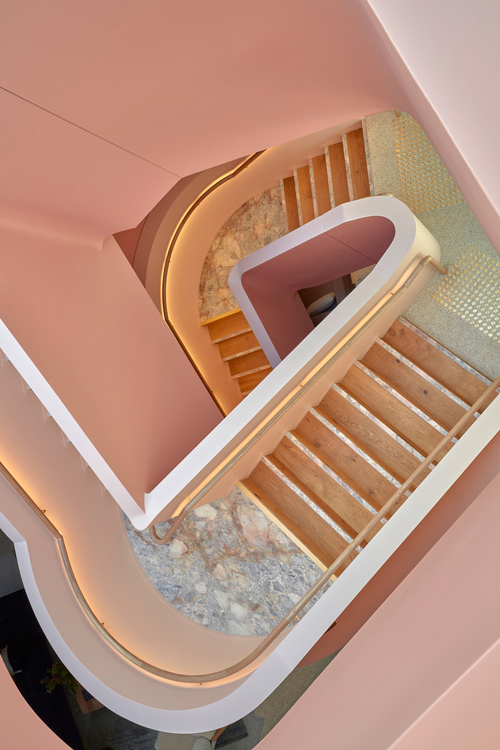
Jardan Sydney – IF Architecture
The stunning Jardan Sydney blush staircase (above) is possibly the most Instagramed set of stairs ever!
IF Architecture on this project: “Using colour as a construction material, the design intention for the Jardan Sydney showroom was to influence the effect colour has on people (psychological) and space (physiological), to complement the furniture and homewares. Energy, warmth and light, enhance perception and create living atmospheres that create unity and ‘classify’ the products”.
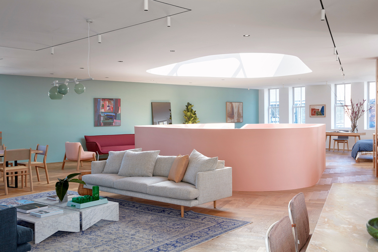
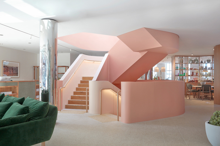
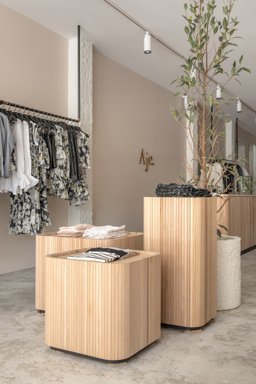
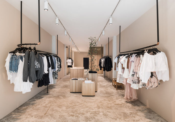
Aje Adelaide – We Are Triibe
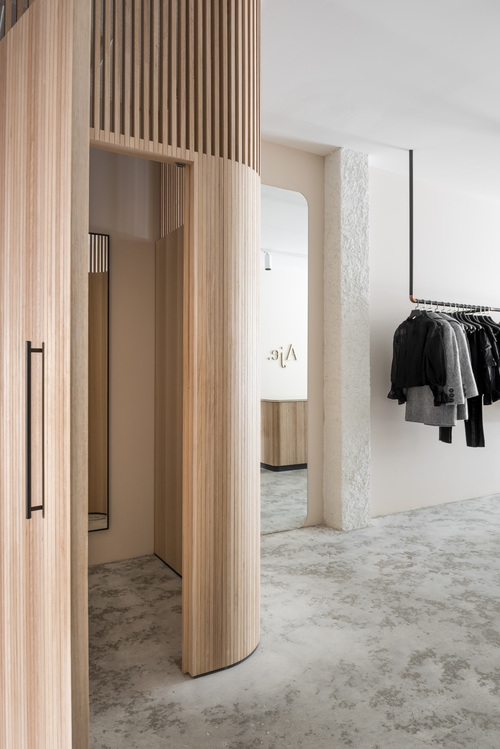
Curved timber fittings, distressed flooring and barely there blush walls create an elegantly refined backdrop for the designer women’s clothing brand.
We Are Triibe on this project: “The Aje retail space sits inside a heritage listed building in the Adelaide CBD. The interior palette emphasises natural and subtle materials. Painted pebble dash columns, a distressed floor finish, solid oak joinery, stone accents and nude walls all create an elegant, tactile design”.
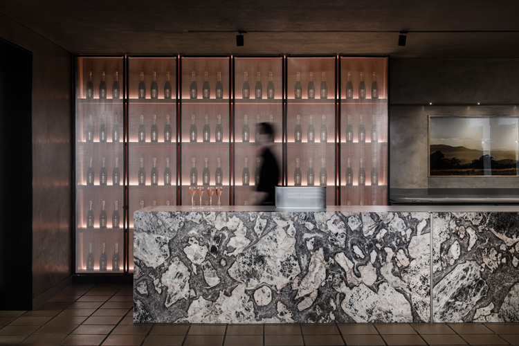
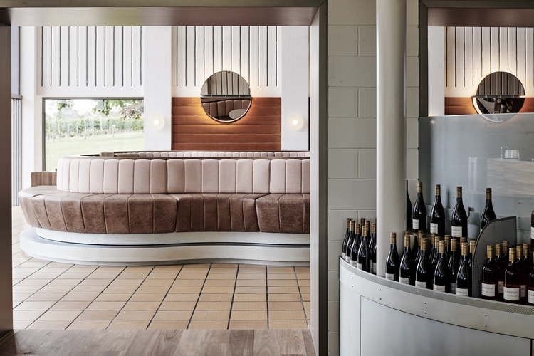
Domaine Chandon – Foolscap Studio
A rich and warm palette, mixed metals and spotted gum joinery combine to celebrate the brand’s 30 year heritage while positioning them freshly and firmly in the 21st century.
Foolscap Studio on this project: “Iconic méthode traditionelle producer Domaine Chandon was due a cellar door rejuvenation that matched the calibre of its offering and heritage. A new brand-immersion across bar, dining, tasting and retail spaces was inspired by the surrounding landscape, the alchemic process of winemaking and the meeting of old and new worlds”.
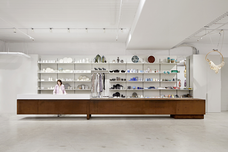
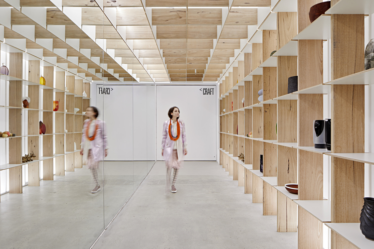
Craft – Karen Abernethy
A pared back palette and simplified design elements allow the handmade products to take centre stage in the new Craft space in Melbourne.
Karen Abernethy on this project: “Craft’s new home celebrates the work of Australia’s talented craftspeople through a series of dynamic and continually changing exhibition and retail spaces. The fit out at Watson Place was conceived with flexibility and longevity in mind to ensure the organisation’s future as it approaches its 50th year”.
Bec & Bridge – George Livissianis
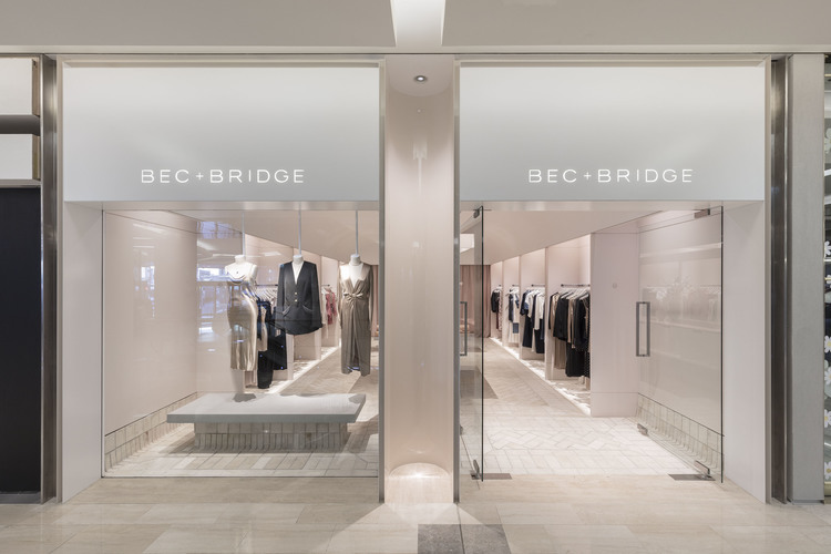
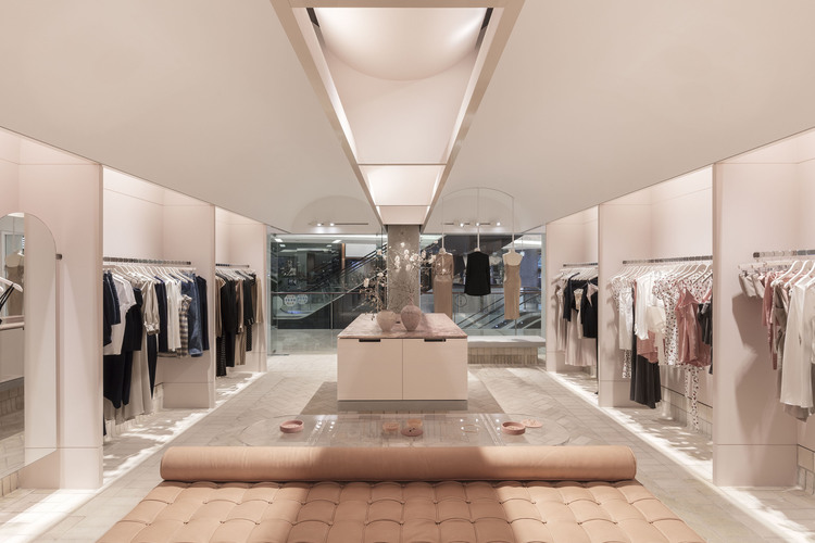
Billowing drapes, luxe button down upholstery and herringbone floors in neutrals and shades of palest blush and coral set the tone for this soft feminine store.
George Livissianis on this project: “The design brief was to create Bec & Bridge’s first flagship store in sydney so we wanted to create an aspirational space with soft lighting and references to the brands outdoor lifestyle”.
You might also be interested to read:
Meet our Educator | Diane Fernandes
What’s the Difference between and Interior Designer and an Interior Decorator?

